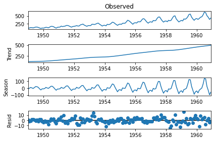
Decomposition
Time series can be thought of as made up of in a few components. Specifically:
- \(S_{t}\): Seasonal component
- \(T_{t}\): Trend component
- \(R_{t}\): Remainder component
These few components can be put together a few ways, but there are two ways that are common:
- Additive decomposition
- Multiplicative decomposition
Additive Decomposition
\[ y_{t} = S_t + T_t + R_t \]
This is relatively easy to understand when we make an additive time series. Here’s an intuitive(-ish) example:
Code
t = np.linspace(-2 * np.pi, 2 * np.pi)
s_t = np.sin(2 * t)
t_t = np.linspace(start=1, stop=len(t) / 5, num=len(t))
r_t = np.random.randn(len(t))

plt.figure(figsize=(14, 7))
plt.title("Additive Time Series")
plt.plot(t, s_t + t_t + r_t, label="Combined Value")
plt.xlim(left=min(t), right=max(t))
plt.legend()
plt.show()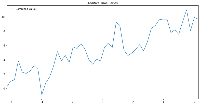
Below we can actually see the separate components I used to make this plot! Notice how each of the series added together creates the final plot above. That’s additive seasonal decomposition in a nutshell. Finding those components.
Code
fig, ax = plt.subplots(nrows=3, ncols=1, figsize=(14, 7), sharex=True)
ax[0].plot(t, s_t, label=r"$S_{t}$", color="blue")
ax[1].plot(t, t_t, label=r"$T_{t}$", color="red")
ax[2].plot(t, r_t, label=r"$R_{t}$", color="green")

ax[0].set_xlim(left=min(t), right=max(t))

ax[0].set_title(r"Seasonal Pattern ($sin(2*t)$)")
ax[1].set_title("Trend")
ax[2].set_title("Remainder")
fig.legend()
plt.show()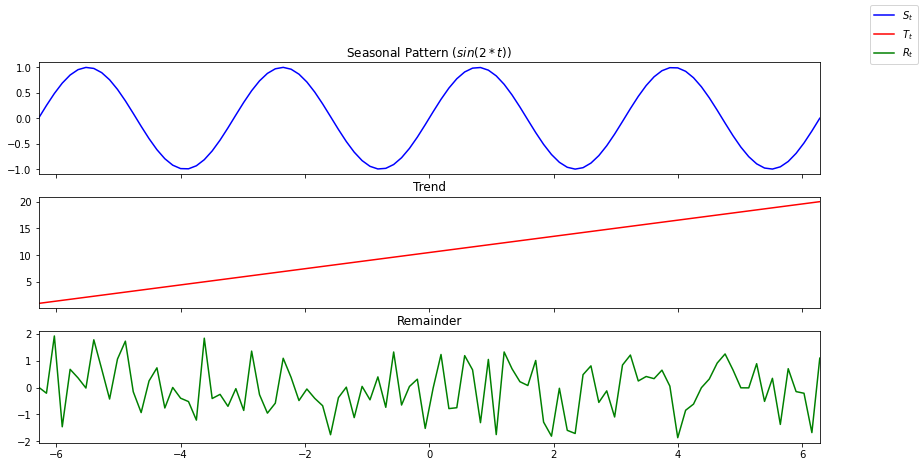
Multiplicative Decomposition
Multiplicative decomposition is the same as additive (in a way) but with multiplication. I know, shocking. Ridiculously shocking.
\[ y_{t} = S_t * T_t * R_t \]
There’s one thing to note that actually is interesting. There’s an increase in the variance from what we see as “trend”.
Code
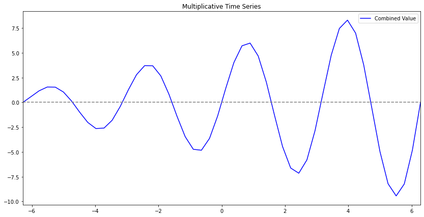
Keep in mind the components are exactly the same as previously.